Pxless is one of those terms that sparks curiosity the moment you see it. It feels technical, slightly mysterious, and not immediately obvious. Yet once you dig deeper, it becomes clear that Pxless is tied closely to how modern digital design and development are evolving.
This guide explains Pxless in a clear and practical way. You will understand what it means, how it is used, why it matters, and how it fits into the bigger picture of web design and user experience.
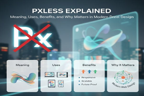
What Pxless Means
Pxless comes from the word “pixel,” often shortened to “px” in design and coding. The “less” part suggests reducing or removing reliance on pixels.
So, Pxless refers to a design or development approach where fixed pixel units are avoided. Instead of setting exact pixel sizes, designers and developers use flexible units like percentages, em, rem, or viewport-based values.
This shift may sound small, but it changes how layouts behave across different devices.
Why Pixels Became a Problem
Pixels were once the standard for everything. Designers would set exact widths, heights, margins, and font sizes using px values. This worked well when screens were more consistent.
Then things changed. Phones, tablets, laptops, and large monitors all entered the scene. Screen sizes and resolutions started to vary widely.
A layout built entirely with pixels often breaks on smaller or larger screens. Text may appear too small on one device and too large on another. Elements can overlap or leave awkward gaps.
Pxless approaches solve this problem by making layouts fluid instead of fixed.
How Pxless Works in Practice
Pxless design replaces fixed units with flexible ones.
For example, instead of setting a font size to 16px, a developer might use rem units. These scale based on the root font size, making text more adaptable.
Widths might be set using percentages so they adjust to the screen size. Viewport units like vw and vh allow elements to scale based on the visible area.
This creates a layout that responds naturally to different devices without needing separate designs for each screen.
The Core Idea Behind Pxless Design
At its core, Pxless is about flexibility.
It focuses on creating layouts that adapt rather than stay rigid. This aligns with responsive design principles, where content should look good and work well on any device.
Instead of controlling every pixel, designers define relationships. They decide how elements should scale and interact rather than fixing them in place.
This approach leads to more consistent user experiences across devices.
Pxless vs Pixel-Based Design
Pixel-based design is precise. It gives full control over exact dimensions. This can be useful for static layouts or specific design needs.
However, that precision becomes a limitation when dealing with multiple screen sizes.
Pxless design sacrifices some control in exchange for adaptability. It allows layouts to adjust automatically, reducing the need for constant tweaks.
The trade-off is worth it for most modern applications, especially websites and mobile-friendly platforms.
Benefits of Using Pxless
One major benefit of Pxless is improved responsiveness. Layouts adjust smoothly across devices without breaking.
Another advantage is better accessibility. Flexible units allow users to adjust text size without disrupting the design. This is especially helpful for people with visual impairments.
Pxless also simplifies maintenance. Developers do not need to create separate styles for every screen size. A single flexible layout can handle multiple scenarios.
Performance can improve as well. Cleaner, more efficient code often leads to faster loading times.
Common Units Used in Pxless Design
Several units replace pixels in a Pxless approach.
Relative units like em and rem are widely used for typography. They scale based on parent or root font sizes.
Percentages are useful for widths and layouts. They allow elements to adjust based on their container.
Viewport units like vw and vh are tied to the screen size. These are helpful for creating dynamic layouts that adapt in real time.
Each unit has its purpose, and experienced developers often combine them for the best results.
Real-World Use Cases of Pxless
Pxless design is widely used in modern websites.
Responsive websites rely heavily on flexible units to ensure they work across devices. E-commerce platforms, blogs, and web apps all benefit from this approach.
Mobile-first design also aligns with Pxless principles. Designers start with smaller screens and scale up, using flexible units to maintain consistency.
Even large platforms use similar techniques to deliver smooth experiences across different devices.
Pxless and User Experience
User experience improves when layouts adapt naturally.
Text remains readable, buttons stay accessible, and content flows smoothly regardless of screen size. Users do not need to zoom in or struggle with broken layouts.
Pxless design reduces friction. It allows users to focus on the content rather than dealing with interface issues.
This leads to longer engagement and better overall satisfaction.
Challenges of Pxless Design
Pxless is not without challenges.
It requires a shift in mindset. Designers and developers must think in terms of relationships and proportions instead of fixed values.
Debugging can also be more complex. Since elements scale dynamically, issues may appear only on certain screen sizes.
Consistency can be tricky as well. Without careful planning, layouts may look slightly different across devices.
Despite these challenges, the benefits often outweigh the drawbacks.
When Pixels Still Make Sense
Pxless does not mean pixels should never be used.
There are cases where fixed values are necessary. For example, borders, shadows, or very specific design elements may require pixel precision.
Icons and images sometimes need exact sizing to maintain clarity.
A balanced approach works best. Use Pxless principles for layout and flexibility, and use pixels where precision is critical.
SEO Benefits of Pxless Design
Search engines favor websites that offer good user experiences.
Responsive design is a key ranking factor. Pxless approaches help achieve this by ensuring layouts work well on all devices.
Faster loading times also contribute to better rankings. Efficient, flexible code often improves performance.
Lower bounce rates can result from better usability. When users stay longer and interact more, search engines take notice.
Pxless design supports all these factors, making it valuable for SEO.
Pxless in Modern Development Trends
Pxless aligns with current development trends.
Frameworks and design systems increasingly rely on flexible units. Developers are encouraged to build scalable and responsive interfaces.
Tools and technologies continue to evolve, making Pxless easier to implement. Many modern CSS features support this approach naturally.
As devices continue to diversify, the need for flexible design will only grow.
Also Read : Lakede Explained: What It Is, How It Works, and Why It’s Gaining Attention
How to Start Using Pxless
Getting started with Pxless does not require a complete overhaul.
Begin by replacing fixed pixel values with relative units where possible. Focus on typography and layout first.
Test designs across different devices and screen sizes. This helps identify areas that need adjustment.
Gradually adopt viewport units and flexible layouts. Over time, the design will become more adaptable.
Learning by doing is the best approach. Small changes can lead to significant improvements.
Future of Pxless Design
Pxless is not just a trend. It reflects a deeper shift in how digital experiences are built.
As technology evolves, flexibility becomes more important. New devices with different screen sizes and resolutions will continue to emerge.
Design systems will likely move further away from rigid structures. Pxless approaches will play a key role in this transition.
The focus will remain on creating experiences that feel natural and consistent across all platforms.
Final Thoughts
Pxless changes how you think about design.
Instead of controlling every detail with fixed values, you create systems that adapt and scale. This leads to better usability, improved performance, and more future-ready designs.
It may take time to adjust, but the results are worth it. Once you understand how Pxless works, it becomes a powerful tool in modern web development.